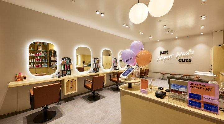
Just Cuts has undergone a brand refresh, introducing its Salon of the Future concept, with a new colour palette, logo and a bright, contemporary ambience.
The refreshed Just Cuts logo features a sleek black design and brand guidelines that align with the fresh new salon aesthetics.
Just Cuts worked with multidisciplinary creative agency The General Store on revitalising the brand. Madeleine Livesey, partner at The General Store, said “The classic wordmark, now made black, stays true to Just Cuts’ iconic heritage, and the refreshed imagery and the salon design celebrate individual style and the hundreds of local communities that the brand operates in.”
The brand refresh focuses on making the customer’s experience as seamless as possible, from the digital check-in kiosk to the Just Cuts App, which provides real-time salon wait times, online check-in and loyalty rewards.
Just Cuts CEO Amber Manning said “This refresh brings a modern vibe to our classic Just Cuts values. We’re proud of our heritage, and this new look reflects both where we’ve come from and where we’re going. We’re staying true to what our clients love — quality, simplicity and making sure every visit is a great experience.”
The hairdressing chain is now rolling out the Salon of the Future designs across the country.


